Overview
My Role: UI/UX Designer - end-to-end design
Timeline: 4 months
Tools: Figma, FigJam
The Problem
Travelers struggle to discover authentic local experiences and plan trips efficiently due to information-heavy, generic travel platforms.
The goal was to design a clear, discovery-first travel app focused on local experiences.
My Approach & Key Decisions
Prioritized experience discovery before trip planning
Simplified information hierarchy to reduce overwhelm
Designed clear user flows to guide users from inspiration to action
This approach ensured the product felt intuitive while remaining content-rich.
Solution
The final design delivers:
A visually engaging discovery experience
Streamlined trip planning flows
Clear calls to action that guide users naturally

Outcome & Learnings
Outcome
Created a clear, intuitive travel discovery experience
Reduced steps needed to plan a trip
What I learned
Strong UX is about removing friction, not adding features
Clear hierarchy is critical in content-heavy products like travel apps
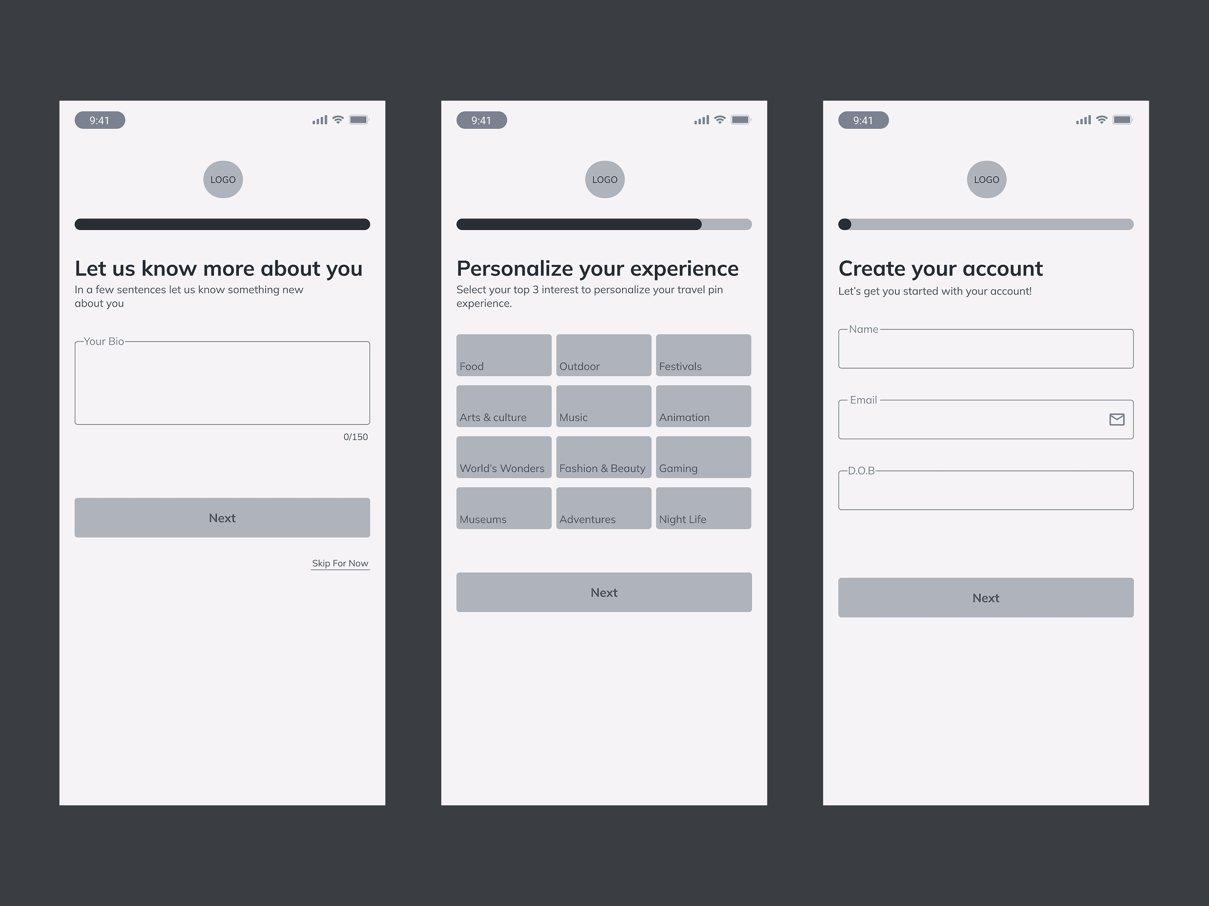
Wireframes
To ensure a clear and intuitive planning experience, I explored multiple layout options through low-fidelity wireframes. The focus was on helping users discover experiences first, then gradually move into trip planning.